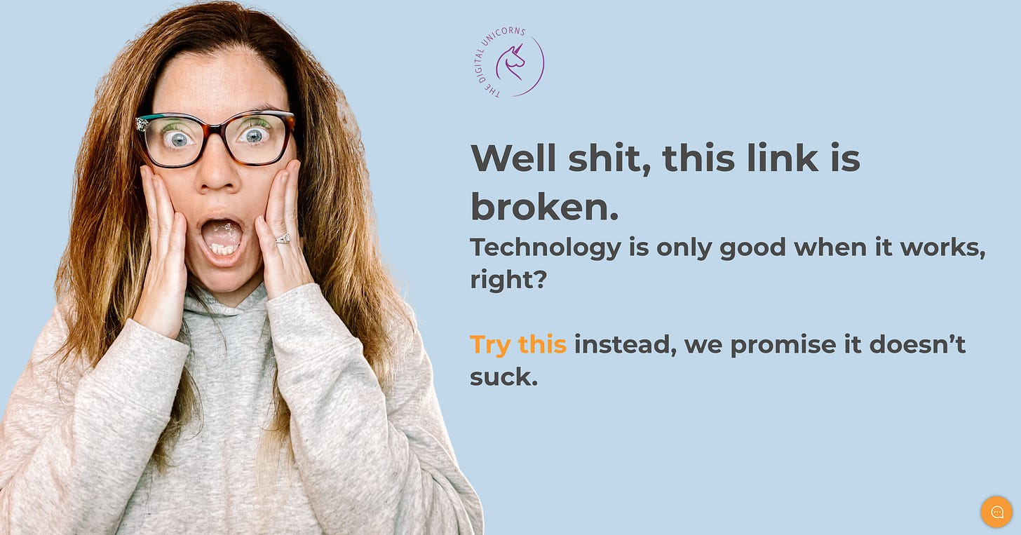
Sh!t happens, right?
Even the best coders and website designers make mistakes once in a while. Broken links are bound to happen at one point or another.
But you know what should never happen? A website user coming across an unhelpful 404 page.
A generic, unhelpful 404 page is lazy.
Your customers are probably short on time, just like all of us are. If they come across a broken link with no easy way to find their way back to a working page on your site, they’re going to close the window and probably never come back.
Only 23% of website users attempt to find the right page after encountering a 404 page.
If your 404 page can point people in the right direction, you have a much better chance at keeping that potential customer on your page.
We just redid our own 404 page for this very reason. Taking 20 minutes of time to create a better user experience for our brand is always worth it.
Here are 4 steps to making your own best-in-class 404 page:
Call out the mistake.
“Oops!”, “Oh no!”, or “Well shit!” are all great ways to call the page what it is. Just find a way to let your users know that the page they’re looking for is not working.
Use your branding.
Your brand voice should carry through everything you do, and this page is no exception. If your brand is funny, use humor. Maybe you can incorporate an industry pun. Use your brand colors and maybe a picture or two.
Point users in the right direction.
Include a button to bring users back to your website so they can find what they’re looking for.
Test it, test it, and test it again.
One broken link is an accident, but a broken link leading to another broken link is just a bad look for your brand. Make sure your page will actually help people and not lead to more frustration. Have a few of your friends test it too, just to be safe.
That’s it! Small details like this page all lead to a better brand experience, which helps you convert and retain your customers. Take a minute today to look at your 404 page to make sure it checks all the boxes!


